First we choose the template we want to edit.
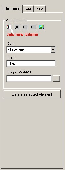
Then we can add an element by clicking on the corresponding icon:
 Elements that can be added are (icons are from left to
right): columns (data in the basic tables), text fields, rounded rectangles, rectangles and images.
When an icon is clicked, a message below the icon group shows which element will be added
when the main template area is clicked. E.g. The text 'Add new column' appears in red font color
when the 'column' icon is clicked. If the same icon is clicked for the second time, the text
disappears, meaning the action of adding elements is cancelled.
The column which is to be added can be selected in the drop down menu 'Data'. The field 'Text' is
used when text fields are added and the 'Image location' field is used when the user has chosen
to add an image to the ticket template.
When the 'Font' tab is clicked, fields that determine font type, size and alignment are shown.
When the 'Print' tab is clicked, the user can select the size and orientation of the paper the ticket
will be printed on.
Templates are saved by clicking on the Save button, or on the Save as... button
if the template is
saved under a different label (which must be typed in the Template label field).